Introducing My New Logo
Introducing My New Logo
A Symbol of Identity, Knowledge, and AI Vision

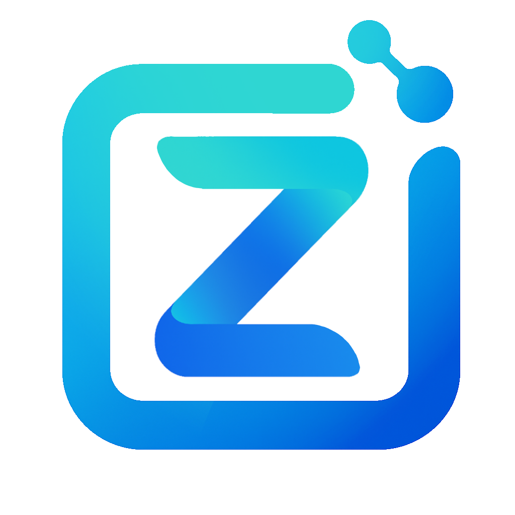
I’m excited to share the new logo I’ve designed for my personal website and research presence. At first glance, the design may appear simple—a stylized “Z” enclosed in a rounded square—but beneath its minimalism lies a deeper reflection of my identity, research interests, and intellectual journey.
The Core Shape: “Z” for Zhaoliang Zheng
The central element of the logo is the letter “Z”, representing my name—Zhaoliang Zheng. The design is modern, fluid, and dynamic, reflecting the evolving and cutting-edge nature of the work I do in artificial intelligence, deep learning, and perception systems. It stands not only as a personal mark but as a symbolic representation of my presence in the AI research community.
The Frame: Structured Thinking, Open Exploration
Encircling the “Z” is a rounded square frame with an open gap—this evokes a balance between structure and openness. The square represents clarity, rigor, and discipline in research, while the open corner suggests curiosity, exploration, and an invitation for collaboration and new ideas.
The Gradient: A Journey Through Knowledge
One of the most meaningful elements of the logo is its gradient color palette, transitioning from light turquoise to deep blue. This represents a personal and intellectual journey—starting from foundational knowledge and advancing toward greater depth and complexity. The gradient mirrors how I approach learning: always building, deepening, and pushing toward new frontiers of understanding.
The Neural Symbol: Intelligence and Connection
Above the frame sits a subtle yet powerful visual node cluster—a neural motif consisting of interconnected circles. This is a nod to deep learning and artificial neural networks, the very core of my research domain. It also reflects how ideas, systems, and data interconnect in my work—creating intelligence through structure and synergy.
Enjoy Reading This Article?
Here are some more articles you might like to read next: